

Yoeri
Gainsight Employee ⭐️⭐️⭐️
April 21, 2020
Release

New topic list view

  • April 21, 2020
  • 26 replies
  • 870 views
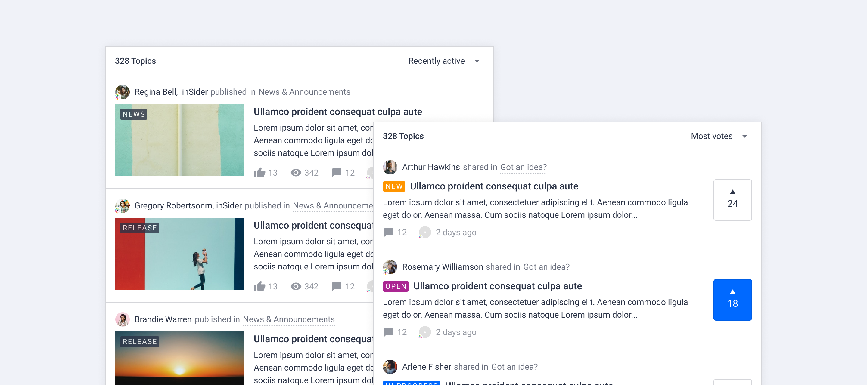
New topic list view

The way we display a list of topics has been improved. Today we rolled out changes with the goal to make the user experience more consistent across the platform, distinguish different content types visually and make content easier to scan.

New topic list view

We made some general changes to all topics cards and some specific changes for ideas and articles. Click Learn more! below to see a visual overview of the new topic card design:
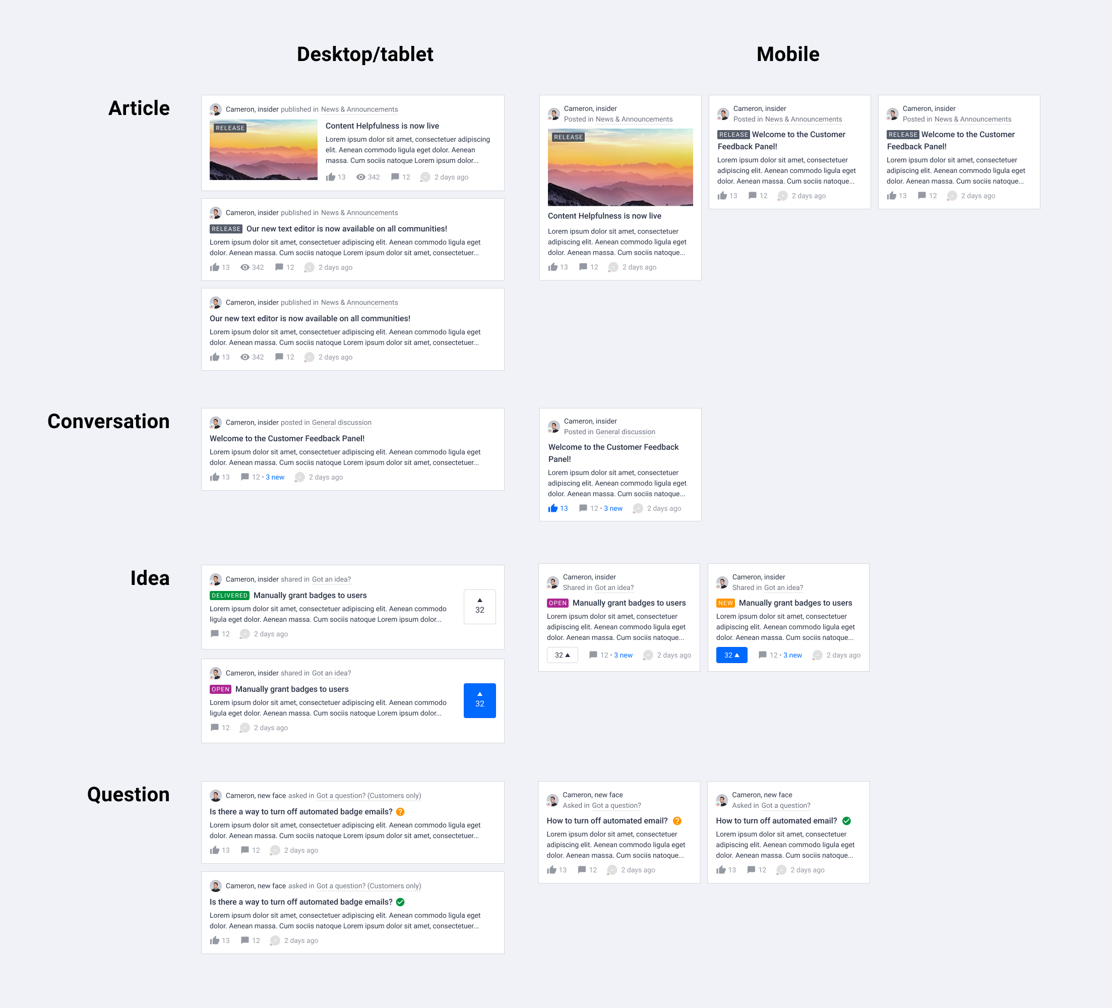


General layout changes

  • Smaller author avatar

  • Change the color of user name from brand color to text color (will be overwritten by rank username styling)

  • Display category info next to author, parent category is now shown

  • Distinguish the content types using different verbs next to author information

  • Amount of views are only displayed on desktop for articles

  • Subtle hover effect for metadata

Upgraded article card in topic list

  • Remove border around image and content

  • Show content right below the title

  • Show label on image if there is a featured image

Upgraded idea card in topic list

  • Highlight the vote action as well as the amount of votes

  • Improve idea status visibility using status label

We hope you like the new changes like we do, if you have feedback let us know in the comments below! We are working on more visual improvements and a new way to change generic styles (colors, cards, fonts, buttons, lists) in your platform. Stay tuned for more!

26 replies

xiaoyu-shen
Helper ⭐️⭐️
April 22, 2020

Hey @bjoern_schulze ,

Thanks for your feedback, really appreciate your detailed checking. 

About the image ratio you mentioned:

Article images: In the screenshots the article image on desktop has an aspect ratio of 16:9, on mobile it is close to 16:9, but a bit different.
The actual aspect ratio on mobile now is close to 21:9 (tested on Samsung Galaxy S10). Why the discrepancy between preview and live? Will you fix this and use the expected 16:9 (i.e. the same aspect ratio as for desktop)? 

The featured image in topic list is respecting our Visual Guide. The actual ratio of the featured image is 9:4. We use this radio in both topic page and topic list on mobile. On desktop/tablet, featured image is cropped into 16:9 (65% of the center part will be shown) so that text won’t be squeezed too much by the wide image.

bjoern_schulze
Helper ⭐️⭐️⭐️
April 23, 2020

Feedback for the vote button: The vote button on the new topic list view isn’t consistent to the vote button on the topic page.

My expectation is that the inactive vote button pulls the colors from the “Toggle button (inactive)” settings and the active button pulls the colors from the “Toggle button (active)” settings. That’s how it is done on the topic page.

Instead it doesn’t use button color settings at all, but the “Branded color” and “Border color”.

bjoern_schulze
Helper ⭐️⭐️⭐️
April 23, 2020

@xiaoyu-shen Thanks for the explanation! So the two basic aspect ratios on inSided remain 9:4 (original) and 16:9 (for most of the teasers)?

Yoeri
YoeriAuthor
Gainsight Employee ⭐️⭐️⭐️
April 24, 2020

The latest UI changes mentioned in my update here have been rolled out 🎉

The unsubscribe icon on the subscription page is restored, the alignment of the icons will be fixed shortly

Group Product Manager, Customer Communities
bjoern_schulze
Helper ⭐️⭐️⭐️
April 28, 2020

Thanks for the quickly developed changes!

I have some feedback from my community regarding the category type “News”. In this category type all content is sorted by the articles’ publish date. A few users already sent “bug reports” that the sorting would be wrong - when it isn’t.

One reason: Users have learned that content ist sorted by last activity. And because the topic list on the category type “News” looks the same as for “Ideation” and “Default”, the users’ expectation is to have the same sorting behaviour.

Another reason: The publish date isn’t displayed at all on the topic list. The only timestamp available is “last activity”, so mixing this up is an easy thing to do.

That’s why I propose to make UI changes for the topic list of the category type “News” in the near future:

  • Different look and feel to “Default” and “Ideation” category types
  • make more use of the article images (have a more magazine style layout)
  • display different meta information (e.g. publish date instead of last activity timestamp)
xiaoyu-shen
Helper ⭐️⭐️
April 28, 2020

Hey @bjoern_schulze

Feedback for the vote button: The vote button on the new topic list view isn’t consistent to the vote button on the topic page.

This was also fixed in the update last Friday. The vote button is now inheriting the toggle button styling and stay consistent with topic page. Thanks for feedback :)

So the two basic aspect ratios on inSided remain 9:4 (original) and 16:9 (for most of the teasers)?

Yes, the article featured image ratio remains the same as before.