
Julian
Gainsight Employee ⭐️⭐️⭐️
October 14, 2019
FEATURE LAUNCH

Our new text editor is now available on all communities!
Related products:CC Community
  • October 14, 2019
  • 168 replies
  • 5350 views
Our new text editor is now available on all communities!

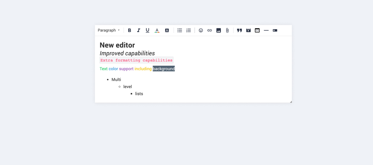
We are very proud to announce that our completely new editor is now available for all users on all communities! :grin::raised_hands::pencil2: We have invested a lot of time to give you and your users more options to create richer content in an easy way - so we hope that you will enjoy working with the new editor as much as we do!

We are investigating line-height / spacing inconsistencies as well as problems with selecting text on some viewports (e.g. Safari on iOS).

Polls are temporarily not available, but will be added again soon.

 Overview of improvements

There are many things which have improved with the new editor, just to name a few:

Improved existing features

  • Image upload
    • Drag & drop images into the editor instead of manual upload
    • Captions (descriptive text underneath uploaded images)
  • Code
    • In-line code is now possible (previously code was in an extra line)
    • Code syntax (code is not being stripped automatically anymore)
  • Lists
    • Multi-level lists are possible now
    • Better UX in working with lists (previously lists could not be interrupted by line breaks)
  • Text styling
    • Text styling within lists was not fully supported before

New features

  • Tables!
  • Callouts
  • Text color / background color
  • Horizontal lines

Of course not all of these features are available to end users, some of these (e.g. text color, header, callouts) are only available in the Control environment for now. We have plans to make this available to front-end users via user roles in the future, so that you are in control of who can make use of these features - please share your thoughts on this with us in the comments!

Feedback

Please let us know what you think of this improvement, also how your users are feeling about it. This way we can adjust and improve the editor even further in the future!

168 replies

Jurgen
Helper ⭐️
October 16, 2019

Our superusers are complaining about quotes and edits.


Our superuser are experiencing a lot of problems in editing their messages. One user had added a quote to his post by accident. He wanted to edit the comment so that there’s only his text and no quote, but he was not able to erase the quotes, leaving the comment looking like this :point_down_tone2:  This happens on Firefox, IE and Chrome.


When quoting, there’s extra rows within the “quote” :


I already adressed this behavior in the preview phase and even posted a video demonstrating it.  @Yoeri acknowledged it and said you should "copy/paste orginal post and put it in a quote". :)


Julian
JulianAuthor
Gainsight Employee ⭐️⭐️⭐️
October 16, 2019

Hi @bjoern_schulze,

also thanks for sharing your feedback with us! :)

Emoticons don’t always seem to be converted from text to icon. Well provide examples when we experience it again

Maybe this happens in edge cases where the editor is not sure if this is part of a sentence or an emoticon:( something like this). Will log it and wait for an update.

The new editor has a complete new behaviour regarding hitting “enter”. Formerly a new line was started, never a new paragraph. Now hitting “enter” creates a new paragraph, while hitting “shift+enter” starts a new line. That’s ok for us, but: The margin-bottom for paragraphs is 8px, which is not much. Are you planning on increasing the margin-bottom globally?

Right, this has been reported before. I think this might be related to the “line-height” issues we knew existed, but I will double-check with the team to be sure.

Font colors can be set in the editor in Control. Are you planning on letting customers configure the chooseable colors? Because then every customer could define own “corporate” colors to create a color palette that fits the company’s style guide.

Currently the plan is to give you the option to enable all colors to be selected via user roles. They are very powerful in the hands of trusted users but also a risk if being abused by detractors. I like the idea of giving you the option to offer single colors that match your brand, will forward it to the team!

File Uploads: Until recently every customer could decide whether to activate file uploads for their community. We opted out of it because of data protection issues. Will we be able to opt out of the file upload function again soon? We really, really, really don’t want our users to upload private files (such as invoices or contracts) to the public.

I have spoken with the team about this and it seems this has to do with a speciality of your community, bascially a custom limitation to disable file uploads while allowing image uploads. Ticket has been created, the team is investigating it currently.

Mobile view: We are currently gathering information what formatting functionalities are a must for our community users to have on mobile and we’ll provide the list soon.

Great, thanks for doing this!

Default text: In the old editor we could place a default text within the text field (via phrases) to give users some guidance about what to write and what not to write. This is missing now. Can you please add the default text again and make it configurable via phrases?

Yes, the ticket for this has been created already, the team will work on offering you this again (of course including the option to adjust it yourself).

Submit button left instead of right: What is the idea behind the new position?

This has to do with being consistent in the location of buttons across the platform. To make a long story short: Previous editor had the button within the editor, this was not desired for the new editor (e.g. for article creation page it would cause issues). We have now made sure that during edit, creation, etc. the button is always in the same place. Our product designer Xiaoyu will come back to this in another comment in here.

I follow my nose, it always knows
Julian
JulianAuthor
Gainsight Employee ⭐️⭐️⭐️
October 16, 2019

Hi@LPortalupi,

thanks for the updates and additional info. I was still not able to reproduce the issue with italics styling. As far as I understand it, you do not activate this styling, but it just starts displaying it in italic by itself, right? The ticket has been created and my colleagues are looking into it.

About creating hyperlinks: As far as I know we plan to have community-links (so to your own community) open in the same tab & have external links open in a new tab. I guess this is closer to what you would like to see?

The issues with line-space are being worked on of course.

I follow my nose, it always knows
xiaoyu-shen
Helper ⭐️⭐️
October 16, 2019

Hi@Jurgen ,

Thank you for providing the feedback! You definitely have eagle eyes. 

  • The control bar at the top really isn't an improvement in my opinion. It's a nuisance when you're making a long post.
    • Placing formatting bar on the top is actually a deliberate choice. Different from the old editor, in new editor the formatting bar is always in user’s view.
    • Old editor: if you would work on a really long article, you would always have to scroll all the way to the bottom if you want to add/change styling.
    • New editor: the formatting bar is always at the top, and you can scroll in the editor field to review the content, while the formatting bar is always sticky on the top.
  • Also, I'm noticing the icons are jumbled in the control bar. In particular: the u is out of place and there's a gap between the icons for quotation and ellipsis.
    • The underline function (u) is not an issue. These icons are from google material icons which is a standard repository. 
    • The space between the quotation and the dropdown button (ellipsis) is bigger than the others indeed. We will improve it in the future. But due to priority, we decided to focus on fixing more critical issues and features first, for example text selecting on touch device, file attachment on mobile, etc.
  • Besides selecting text, right click cutting, copying and pasting doesn't seem to work correctly. (link)
    • We are aware of this issue, and we will work a fix. 
  • In a marked answer, someone's bold text seems to have jumped to the right. (link)
    • Edit: This one is clear, we will also look into this!

Hope it is helpful :)

Jurgen
Helper ⭐️
October 16, 2019

@xiaoyu-shen Thanks for replying at length :)


The control bar at the top really isn't an improvement in my opinion. It's a nuisance when you're making a long post.

  • Placing formatting bar on the top is actually a deliberate choice. Different from the old editor, in new editor the formatting bar is always in user’s view.
  • Old editor: if you would work on a really long article, you would always have to scroll all the way to the bottom if you want to add/change styling.
  • New editor: the formatting bar is always at the top, and you can scroll in the editor field to review the content, while the formatting bar is always sticky on the top.


“The formatting bar is always in view”. Well in practice, you can definitely scroll past the edit bar both on desktop and on mobile. This happens if you scroll outside of the editor. In the old editor this was less likely to happen it seems. The stickiness and placement are 2 seperate things: you could keep the stickiness while still placing the editor below the text field.

However, this might just be my personal pet peeve and something I'll get used to over time.


  • The underline function (u) is not an issue. These icons are from google material iconswhich is a standard repository. 
  • The space between the quotation and the dropdown button (ellipsis) is bigger than the others indeed. We will improve it in the future. But due to priority, we decided to focus on fixing more critical issues and features first, for example text selecting on touch device, file attachment on mobile, etc.


Nothing's wrong with the icons themselves, it's just the way they’re spaced and outlined that's jarring. I agree that this isn't a critical issue. The other issues should be fixed first.

LPortalupi
Helper ⭐️
October 16, 2019

Hi@LPortalupi,

thanks for the updates and additional info. I was still not able to reproduce the issue with italics styling. As far as I understand it, you do not activate this styling, but it just starts displaying it in italic by itself, right? The ticket has been created and my colleagues are looking into it.

About creating hyperlinks: As far as I know we plan to have community-links (so to your own community) open in the same tab & have external links open in a new tab. I guess this is closer to what you would like to see?

The issues with line-space are being worked on of course.

Thanks, @Julian. I’ll try to take a screen recording next time the italics issue occurs. It happens in certain situations when I want to shift from Italics to Roman style text; whether the “Italics” icon appears to be selected or not, the text is always italics. cc @Marie S 

I like the idea of having in-community links open in the same window with external links opening in a new tab. 

Thank you!

LPortalupi
Helper ⭐️
October 16, 2019

Hi, I’m back. :upside_down:  Is there a way for me to change the text color of image captions? It’s showing very light grey, so the contrast with the white background is minimal, which is challenging for people with visual impairments. Thank you.

An example within an example!


Suvi Lehtovaara
Helper ⭐️⭐️
October 17, 2019

Our superusers are complaining about quotes and edits.


Our superuser are experiencing a lot of problems in editing their messages. One user had added a quote to his post by accident. He wanted to edit the comment so that there’s only his text and no quote, but he was not able to erase the quotes, leaving the comment looking like this :point_down_tone2:  This happens on Firefox, IE and Chrome.


When quoting, there’s extra rows within the “quote” :


I already adressed this behavior in the preview phase and even posted a video demonstrating it.  @Yoeri acknowledged it and said you should "copy/paste orginal post and put it in a quote". :)


Sorry@Julian and @Jurgen  - my bad! Too many details :see_no_evil:

https://yhteiso.elisa.fi/
Suvi Lehtovaara
Helper ⭐️⭐️
October 17, 2019

Hi@LPortalupi,

thanks for the updates and additional info. I was still not able to reproduce the issue with italics styling. As far as I understand it, you do not activate this styling, but it just starts displaying it in italic by itself, right? The ticket has been created and my colleagues are looking into it.

About creating hyperlinks: As far as I know we plan to have community-links (so to your own community) open in the same tab & have external links open in a new tab. I guess this is closer to what you would like to see?

The issues with line-space are being worked on of course.

Thanks,@Julian. I’ll try to take a screen recording next time the italics issue occurs. It happens in certain situations when I want to shift from Italics to Roman style text; whether the “Italics” icon appears to be selected or not, the text is always italics. cc@Marie S 

I like the idea of having in-community links open in the same window with external links opening in a new tab. 

Thank you!

@LPortalupi  & @Julian This issue with the Italics has been noted by (at least) one our superusers as well - he uses Firefox (if that’s relevant 🙂 )

https://yhteiso.elisa.fi/
Suvi Lehtovaara
Helper ⭐️⭐️
October 17, 2019

Hi@bjoern_schulze,

also thanks for sharing your feedback with us! :)

Emoticons don’t always seem to be converted from text to icon. Well provide examples when we experience it again

Maybe this happens in edge cases where the editor is not sure if this is part of a sentence or an emoticon:( something like this). Will log it and wait for an update.

@Julian  and @bjoern_schulze I assume this is the same issue :point_down_tone1: ?


https://yhteiso.elisa.fi/